Sunday, July 25, 2010
Helen's last letters
Helen has been out of action for a while, but has finished the last of her letters! Her completed final piece will feature shortly (once I get my act together - apologies Fiona).
Tubular peace bell for my first alphabet
There are so many great pieces being posted that I felt I needed to get my skates on and put my first alphabet together in one 3D sculptural piece.

I decided to to create a set of tubular bells on the theme of peacefulness and joy. So I have used the vowels to create five pipes with the following words: pax, joy, hum, lit (for light) and zen. The other eleven letters were used to create two other pipes.
As you can see from the photos above the final piece took on a bit of a temple bell look.
It all took a bit longer than I thought. I needed six rivets per letter as some of the foldformed letters and beaten metal letters were pretty hard to bend around the pipe; and of course I needed to make and paint the stand; and Fiona and I needed to discuss options for hanging the pipes and their length; and then they had to be cut and drilled; and hanging them with nylon fishing line was the final challenge.
The good news is that whilst they are not tuned they do make a lovely sound.
Saturday, July 24, 2010
Kim Schoenberger - B
I intend to post a letter a week so I can explain my process as I go step by step... mostly via images and inturn making my monthly report of all four letters shorter.
B - applied clay
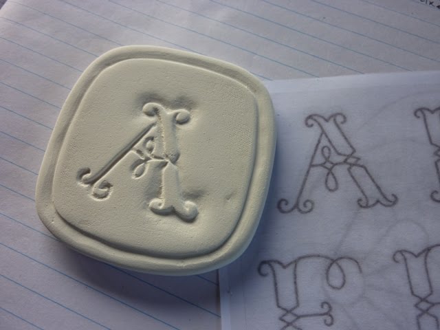
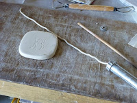
Using an extruder for icing cakes, porcelain clay is extruded through to make a small coil. A fine 'B' imprinted into the clay tile, via tracing paper.
...starting to build the letter by using the extruded coil, placed over the imprint with a little water to secure and adhere.
Letter B starting to take shape, tools used; brush to apply water on imprint and pointed wooden tool to shape the clay and run along edges to seal.
Fine tuning... adding more coil on each end and in the centre and shaping. Carving the edge for the border with a carving tool, still at the leatherhard stage.
Finished off by leaving to dry then sanded with a fine sanding pad for a smooth surface (in the raw stage ready for bisque).
Thursday, July 22, 2010
Noela's latest
WEEK 3
...hmmmm, more smudging as I glued the tissue paper over the background. Once dry, I ironed the letters which made them nice and flat but they are still smudgy.
Time to get out the white ink - see what I can do with that.
Wednesday, July 21, 2010
Done and dusted!
Tuesday, July 20, 2010
NOELA'S WEEK 2
Last week was week 2, and I painted some tissue paper with mottly blues.
The idea is to cut tissue squares a little smaller than the 7cm backgrounds and to paste them over the ink drawn letters to soften the effect.
One of the problems I faced was that the tissue stuck to the plastic background when dry, so some of the tissue had to be scraped off ending up rather like crepe paper.
The idea is to cut tissue squares a little smaller than the 7cm backgrounds and to paste them over the ink drawn letters to soften the effect.
One of the problems I faced was that the tissue stuck to the plastic background when dry, so some of the tissue had to be scraped off ending up rather like crepe paper.
Fortunately there was enough 'good' painted tissue left to use for my overlays.
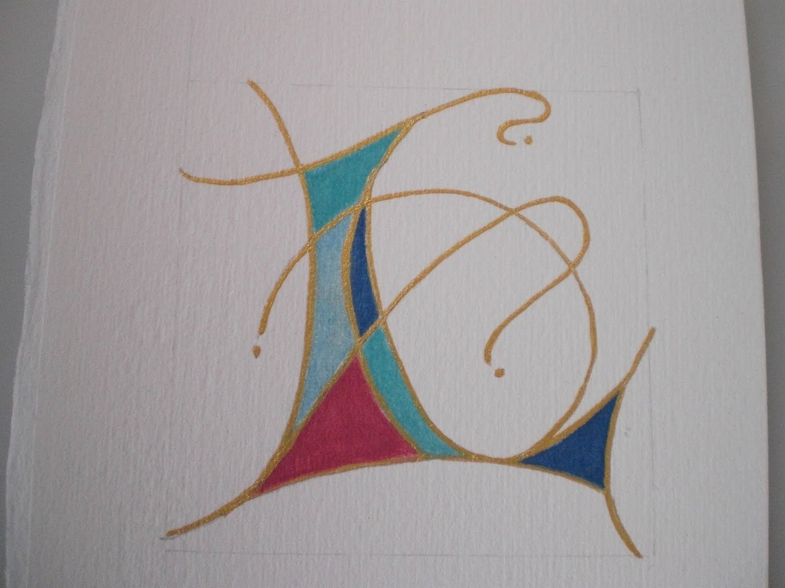
Kim Schoenberger - 'A' ...a change of medium!
With all good intentions in getting a head start with my recycled teabags, I go and change my mind!
Once I explored my options in clay, the spark was ignited and I just had to go with it.
I have chosen to use Porcelain clay, and will be using different methods and techniques to create each letter. Seeing that they are so small and my kiln much larger, I have decided to complete the whole alphabet.... then place them in a bisque, glaze, then fire to Stoneware. So each image initially will be at the raw stage until I start firing in the kiln. And, I have decided to use red, black and white as my colour scheme.
Using a slabroller to make my 7 x 7cm tiles, firstly, I have to allow for shrinkage...each clay body has it's own shrinkage rate and at different temperatures. In this case I've allowed for 12% shrinkage. Fingers crossed the end result will come close to the desired size!
Great skill went into the design for cutting the tile, a round tin close to 7 x 7cm. Yep... that'll work, a flaten here and a flaten there, makes for a nice 7.84 x 7.84cm (must allow for shrinkage)square'ish shape...a test drive and it's a go'er!
Patience is a must in claywork especially in the winter months. Once the slab is rolled the tile can be cut...care must be taken as clay has a memory, if it is distorted at this stage and reflatened it will remember and distort back in the final firing. So it is left until the leatherhard stage (inbetween - wet & dry) before working on it
Labels:
ALaW,
alphabet 2,
July,
Kim Schoenberger,
Porcelain
Sunday, July 18, 2010
NOELA'S SECOND ALPHABET
Yeah!! I have started my second alphabet.
I am trying an entirely different approach with this one.
I have decided to do 26 stages of the whole alphabet rather than 26 letters individually. That way I can let the letters 'evolve' and I can share the challenges and solutions along the way.
WEEK 1
I used a PILOT Parallel Pen on soft Japanese pre painted paper.
I had problems with the ink bleeding but wanted to persevere because I like the background paper.
Wednesday, July 14, 2010
Et maintenant, le premier alphabet - And now, the first alphabet
Bonjour,
Hello
Que vont-elles donc devenir, ces lettres par semaine ? Les stocker ? Ca ne convient pas à la ligne éditoriale de la maison... ;) Les jeter ? Cela choque mon sens de l'économie... J'ai trouvé mieux... ;) Je les ai reliées en carnet... un peu comme un abécédaire... mais sans illustration... avec une reliure japonaise...
What will they then become, those letters per week? The store? It does not fit the editorial line of the house ... ;) Throw? This offends my sense of economy ... I better ... ;) I have related in the book ... just as an ABC ... ... but not illustrated with a binder Japanese ...
Hello
Que vont-elles donc devenir, ces lettres par semaine ? Les stocker ? Ca ne convient pas à la ligne éditoriale de la maison... ;) Les jeter ? Cela choque mon sens de l'économie... J'ai trouvé mieux... ;) Je les ai reliées en carnet... un peu comme un abécédaire... mais sans illustration... avec une reliure japonaise...
What will they then become, those letters per week? The store? It does not fit the editorial line of the house ... ;) Throw? This offends my sense of economy ... I better ... ;) I have related in the book ... just as an ABC ... ... but not illustrated with a binder Japanese ...
Je ne suis pas sûre d'être tout à fait au point en ce qui concerne la reliure japonaise, mais je vais bien finir par savoir m'y prendre... Par exemple pour ce carnet, je crois qu'il aurait fallu que je laisse davantage de papier sur la gauche des lettres alors que je les ai centrées sur l'adossement. En reliant les cartons "chocolat", le fil emprisonne trop de la marge gauche...
I am not sure of being right at the point in regards bookbinding Japanese, but I'll get to know me well ... take for example this book, I think it would I had to leave more paper letters on the left while I have focused on admission. By connecting the pipeline "chocolate", the wire traps too much margin left ...
Bonne journƩe.
I am not sure of being right at the point in regards bookbinding Japanese, but I'll get to know me well ... take for example this book, I think it would I had to leave more paper letters on the left while I have focused on admission. By connecting the pipeline "chocolate", the wire traps too much margin left ...
Bonne journƩe.
Sunday, July 11, 2010
Lettres de juin - les derniĆØres - last letters
Bonjour,
Voici venues les dernière lettres de la première série "lettres de la semaine pour 2010"... J'ai utilisé des alphabets dont je n'ai pas du tout l'habitude, pour une seule lettre, ça pouvait aller... Ce sera à travailler un petit peu plus tard.
Hello
Here come the last letters of the first series "Letters of the week for 2010" .. I used scripts that I have not used for a single letter, it could go ... This will work a little later.
J'ai trouvé une petite brochure de calligraphie "Anglaise"... La première partie montre les minuscules, la deuxième les majuscules, dont est issu ce "Y". Pour l'application de la couleur, j'ai utilisé l'effet "monotype"... Je devrais faire cela plus souvent. Cela donne du relief.
I found a small booklet calligraphy "Anglaise" ... The first part shows the tiny, second upper, which resulted in the "Y". For the application of color, I used the effect "monotype" ... I should do that more often. This gives relief.
Et la troisième partie de la brochure montre une interprétation plus moderne dérivé de cet alphabet "Anglaise"... imprimé ensuite d'un tampon décoratif "écriture...
And the third part of the brochure shows a more modern interpretation derived from the alphabet "English" ... then print a stamp decorative "script ...
Voilà , la première série est finie... Il ne reste plus qu'à arranger ces lettres...
Bonne journƩe
So, the first series is over ... It only remains to arrange these letters ...
Good day
Voici venues les dernière lettres de la première série "lettres de la semaine pour 2010"... J'ai utilisé des alphabets dont je n'ai pas du tout l'habitude, pour une seule lettre, ça pouvait aller... Ce sera à travailler un petit peu plus tard.
Hello
Here come the last letters of the first series "Letters of the week for 2010" .. I used scripts that I have not used for a single letter, it could go ... This will work a little later.
J'ai trouvé une petite brochure de calligraphie "Anglaise"... La première partie montre les minuscules, la deuxième les majuscules, dont est issu ce "Y". Pour l'application de la couleur, j'ai utilisé l'effet "monotype"... Je devrais faire cela plus souvent. Cela donne du relief.
I found a small booklet calligraphy "Anglaise" ... The first part shows the tiny, second upper, which resulted in the "Y". For the application of color, I used the effect "monotype" ... I should do that more often. This gives relief.
Et la troisième partie de la brochure montre une interprétation plus moderne dérivé de cet alphabet "Anglaise"... imprimé ensuite d'un tampon décoratif "écriture...
And the third part of the brochure shows a more modern interpretation derived from the alphabet "English" ... then print a stamp decorative "script ...
Voilà , la première série est finie... Il ne reste plus qu'à arranger ces lettres...
Bonne journƩe
So, the first series is over ... It only remains to arrange these letters ...
Good day
Saturday, July 10, 2010
THE FINAL FOUR FROM MIEKE.
I had to cheat a bit because I totally forgot the M….for me a very important letter so I don’t know what happened. It is therefore not glazed but PAINTED looks totally different to me so I will replace it with a proper one at a later time.
M-Painted
Y-Glazed and glass
G-Slip and glazed
P-Underglaze and clear glaze.
Friday, July 9, 2010
Thursday, July 8, 2010
Kim Schoenberger - ALaW 2010 First alphabet
I thought I'd share a couple of pictures to show you how my first alphabet has come up now I have finished it...
I've split the alphabet into two, placing 13 squares onto each post. The posts are from an old weathered pallet I scored from one of my local tip hunts while looking for rusty bits for my letters. Thinking it had character, and knowing only too well it would come into good use down the track, I convinced Glen it was a worthy find and to bring it home with us, thankfully he agreed.
Here's a detail of the image (below), you can see the nails at each side, random and distorted which were left behind from the other planks levered off. They gave such a groovy look to the posts I just had to leave them there!
...most definitely a Rosalie Gascoigne influence going on here.
Labels:
ALaW,
all letters,
alphabet 1,
discarded,
Kim Schoenberger
Wednesday, July 7, 2010
Une lettre par semaine - juin/ A letter a week - june
Bonjour,
Et voilĆ de nouveau le premier mercredi du mois... Et ce qu'il a de bien ce mois-ci, c'est qu'il s'agit du mois des vacances... Chouette alors !!! Cela va faire du bien... Enfin j'espĆØre...
Hello
And here again the first Wednesday of the month ... And it was good this month, is that it is the holiday month, so ... Owl! Cela va faire du bien... This will be good ... Enfin j'espĆØre... Finally I hope ...
Voici donc de nouveau les lettres du mois de la première série "" Letters of the week for 2010 ""... Cela devient difficile... Bien sûr je cherche toujours à changer d'alphabet, mais j'ai du mal à en trouver de nouveaux... Je garde toujours les mêmes couleurs, j'ai utilisé à nouveau des tampons décoratifs avec les peintures brillantes...
So here again the letters of the month the first series "Letters of the week for 2010"... It becomes difficult ... Of course I always try to change the alphabet, but I have a hard time finding new ... I always keep the same colors, I used to re-paint decorative stamps with brilliant ...
J'ai commencé par utiliser un alphabet de Julien Breton, pour le fond j'ai essayé des spirales, mais je n'ai pas été très efficace alors j'ai repassé le tout, ça ressort tout en discrétion comme cela.
I began by using an alphabet of Julien Breton, for the background I tried spirals, but I have not been very effective so I ironed it all, so it is clear and discreet .
Puis un alphabet "gestuel" je crois issu du site de Julien Chazal... Pour innover, j'ai testƩ le "canetto-pen" pour la lettre et pour les tracƩs de couleurs... Ben on va dire que c'Ʃtait un essai...
Then an alphabet "sign" I think from the site of Julien Chazal... To innovate, I tested the "Canetto-pen" for the letter and color plots ... Ben on va dire que c'Ʃtait un essai... Ben is going to say it was a test ...
Puis un alphabet dont j'ignore totalement l'origine, qui ressemble Ć un alphabet scolaire...
Then a script which I have no idea of origin, which resembles an alphabet school ...
Et l'alphabet "Baker" à l'aide d'un bout de cagette, j'ai l'impression que je l'ai déjà utilisé celui-ci mais bon, ça ira bien aussi...
And the alphabet "Baker" using a piece of crates, I feel that I've used it but hey, it will be fine too ...
Rendez-vous le mois prochain pour les deux derniĆØres lettres,
Bonne journƩe
See you next month for the last two letters,
Bonne journƩe Good day
Et voilĆ de nouveau le premier mercredi du mois... Et ce qu'il a de bien ce mois-ci, c'est qu'il s'agit du mois des vacances... Chouette alors !!! Cela va faire du bien... Enfin j'espĆØre...
Hello
And here again the first Wednesday of the month ... And it was good this month, is that it is the holiday month, so ... Owl! Cela va faire du bien... This will be good ... Enfin j'espĆØre... Finally I hope ...
Voici donc de nouveau les lettres du mois de la première série "" Letters of the week for 2010 ""... Cela devient difficile... Bien sûr je cherche toujours à changer d'alphabet, mais j'ai du mal à en trouver de nouveaux... Je garde toujours les mêmes couleurs, j'ai utilisé à nouveau des tampons décoratifs avec les peintures brillantes...
So here again the letters of the month the first series "Letters of the week for 2010"... It becomes difficult ... Of course I always try to change the alphabet, but I have a hard time finding new ... I always keep the same colors, I used to re-paint decorative stamps with brilliant ...
J'ai commencé par utiliser un alphabet de Julien Breton, pour le fond j'ai essayé des spirales, mais je n'ai pas été très efficace alors j'ai repassé le tout, ça ressort tout en discrétion comme cela.
I began by using an alphabet of Julien Breton, for the background I tried spirals, but I have not been very effective so I ironed it all, so it is clear and discreet .
Puis un alphabet "gestuel" je crois issu du site de Julien Chazal... Pour innover, j'ai testƩ le "canetto-pen" pour la lettre et pour les tracƩs de couleurs... Ben on va dire que c'Ʃtait un essai...
Then an alphabet "sign" I think from the site of Julien Chazal... To innovate, I tested the "Canetto-pen" for the letter and color plots ... Ben on va dire que c'Ʃtait un essai... Ben is going to say it was a test ...
Puis un alphabet dont j'ignore totalement l'origine, qui ressemble Ć un alphabet scolaire...
Then a script which I have no idea of origin, which resembles an alphabet school ...
Et l'alphabet "Baker" à l'aide d'un bout de cagette, j'ai l'impression que je l'ai déjà utilisé celui-ci mais bon, ça ira bien aussi...
And the alphabet "Baker" using a piece of crates, I feel that I've used it but hey, it will be fine too ...
Rendez-vous le mois prochain pour les deux derniĆØres lettres,
Bonne journƩe
See you next month for the last two letters,
Bonne journƩe Good day
Monday, July 5, 2010
WXYand Zeeeeeee
Here is my last posting for this series of letters ...
Gosh it doesn't seem like six months already - it's be good fun - not only constructing my own letters but also to watch the other bloggers working their way through the alpahbet ... such variety and such artistic skills ... congratulations to us all ...
So now onto the next set ... this time I am going to combine clay and glass - stay tuned ... in the meantime, I hope youi'll enjoy my WXY and Zeeee ...


Fiona's June letters - first alphabet done!
Here are the last of my experimental alphabet letters. It's been great fun trying different techniques and discovering new mediums.
W - is a small attempt at collage. It includes a small square of rusted paper, a fragment of rusted fabric, a red dot and the letter written in k.
X - was experimenting writing with bleach on black cotton - I like how it came out kind of blotchy.
Y- was an episode and a half! After many highways and byways it is gesso on wood, painted then lightly gilded and written on in ink.
Z - was my first attempt at writing on leather. It is ink on leather with some little background doodles.
All of them were written with a broken finger (which is now on the way to recovery - yay) so the writing is wobbly in places.
W - is a small attempt at collage. It includes a small square of rusted paper, a fragment of rusted fabric, a red dot and the letter written in k.
X - was experimenting writing with bleach on black cotton - I like how it came out kind of blotchy.
Y- was an episode and a half! After many highways and byways it is gesso on wood, painted then lightly gilded and written on in ink.
Z - was my first attempt at writing on leather. It is ink on leather with some little background doodles.
All of them were written with a broken finger (which is now on the way to recovery - yay) so the writing is wobbly in places.
I am pretty excited by the thought of the next alphabet - but still haven't actually, finally and definitively decided what I'm doing!
Saturday, July 3, 2010
So many great letters
So many people have completed so many great letters to complete our first alphabet. My last four letters have been relatively easy as they are all straight lines and therefore I was able create them using the foldforming approach.
I have attempted to start and finish each fold within the border of the metal. This is a bit more challenging than just running the letter off the 'page'; it also results in a much softer or subtle fold. The metal is buckled because the folding was done without annealing the metal.
I have added the photo above to show the contrast between my earlier letters where the fold is running off the metal and these later letters contained within the plate. Somehow when I photographed the six letters together I picked up what I thought was a nice tinge of blue.
Mariella's completed first alphabet!
Then, here goes the whole assembled set. I decided that grey color would not eat the colorful letters and the word "alfabetos" -alphabets- can be read as a soft background.
My husband, Gustavo, who is an architect, did it for me in Photoshop as I told you before.
Hope all of you enjoy it.
Hugs,
Mariella.
My husband, Gustavo, who is an architect, did it for me in Photoshop as I told you before.
Hope all of you enjoy it.
Hugs,
Mariella.
Please double-click the image to see it larger; I had to make it this size to fit on the page - Fiona
Subscribe to:
Posts (Atom)