Thursday, April 29, 2010

Week 17

Hi all,
I figure if we are into week 17, thanks to Fiona's chart [see, I am using it!!], we should have 17 letters posted by now. I need to post 2 to be up to date, so here they are.
P - select, copy, paste, clone
This one was a little tricky as I had to add some more shadow to the left side of the bolt to make it more convincing.

Q - flip, lasso, copy, paste, add shadow.
...again, a bit tricky but fun 'cos I like the end result.

Monday, April 26, 2010

A Day in the Life of K

... here we go - another day ...

6am - yawn - wow look at that - the sun's shining at last ...
6.15am - on with the joggers and off we go ...
7am - breakfast - the most important meal of the day ...
7.30am - and while I'm still alert enough ... meal for the brain ...
33 across - three letters - beginning with K and meaning "to know" ...

8.30am - into the workshop - amongst my friends ...

10.30 - I do love a good parade ...

11.30am - morning coffee at the Up Front Club with chums ...
afternoon - quality time with the family cat ... Purcell
7pm - just an ordinary-everyday-type dinner

9pm - catch-up on world news ...

11pm - "...would you mind closing the door please ..."
11.30pm - and finally to bed - to sleep - perchance to dream !!!
Life is certainly full when you are a K ...
I wonder what the other 25 get up to during the day ...
bought to you by Ken Munsie ..

Friday, April 23, 2010

Noela's 'N'

I did a bit of cheating this week as I have been very busy after my time away. I cloned away the top of the 'h' and stretched the 'n' to make it a bit taller.

April letters from Mieke.

Five this time, I was a bit to fast making the photo and totaly forgot to put them in order!

K- stoneware clay,Twisted clay for the letter in an oxide wash,    
      background, underglaze with a clear glaze over the top.
N- b.r.t. clay, letter in an crawl glaze, background is a bead glaze.
C- slumped glass
R- b.r.t. clay, letter squeezed clay, glazed in a green glaze.
H- stoneware clay,Twisted clay for the letter in oxide wash,   
      background, underglaze with a clear glaze over the top.

Friday, April 16, 2010

JGR letters for April

Well, this set of letters began with an experiment in texture and dimension. I used acrylic paint and dye on Kromecoat cardstock. It has a shiny surface which allows for some delicious subtle textures to occur. Sadly the scanner doesn't do justice but you can see some of the streaks and smears. 
Anyway I 'painted' letters with dimensional craft paint, it has a thin nozzle that makes it easy to work with. After it dried, I rubbed different colors of dye and acrylic paint over the raised letterforms to get the streaky look. Let it dry again, then I scanned everything in order to post.

That's where it got really interesting (I think). In January I made a template for posting my .jpgs as I was dragging my first scanned letter into the template - it became quite cropped due to resolution. I liked the abstract shape that occurred, so I left it. Each letter below is a cropped version of the original: M,N,O,P. 
 
Thank you for viewing,

Sunday, April 11, 2010

Lettres de mars - Letters from march

Bonjour,
Hello,

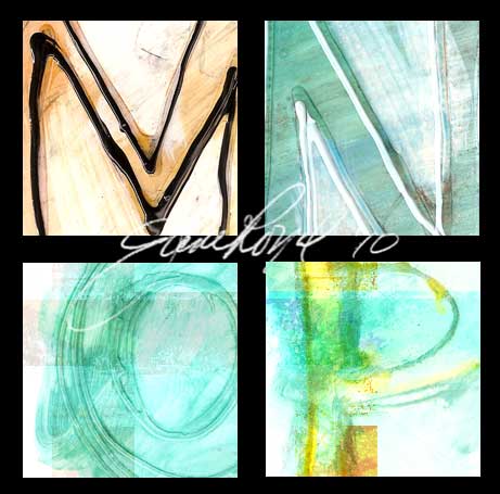
Je dois admettre que je n'ai pas tout à fait le temps de réaliser mes lettres le projet "une lettre à la semaine pour 2010" ce début de mois... En fait, j'avais pris de l'avance lors des dernières vacances... J'avais écrit les lettres, il ne me restait plus qu'à les mettre en couleurs... ;) J'ai gardé bien évidemment les mêmes peintures pour rester dans la même gamme de couleurs, mais j'avais continué à chercher des alphabets différents... toujours dans le livre de David Harris, "Calligraphie : cent alphabets"...

I must admit that I did not quite time to make my letters the project "one letter per week for 2010 early this month ... In fact, I had taken the lead during the last holiday ... I wrote the letters, I just had to put them in color ... ;) I obviously kept the same paintings to remain in the same range of colors, but I continued to search for different scripts ... always in the book by David Harris, "Calligraphy: One hundred alphabets" ...

Et j'ai trouvé une "Capitale foundationales" à la page 68... garnie de gouttes ... Efficace... mais salissant... pour le bout du doigt... ;)

And I found a "foundational Capital" on page 68 ... garnished with drops ... Effective ... but dirty ... for fingertip ... ;)


... une "Capitale Rustique" à la page 50... J'ai recouvert de bleu et ajouté quelques arabesques...

... a Capital Rustic "on page 50 ... I covered with blue arabesques and added some ...

... une "capitale Bénéventine moderne" p 72... Encore des gouttes et une paille cette fois... Difficile de contrôler la trajectoire de la trace, mais là-encore, ça peut réussir quelquefois...

... a "capital Beneventan modern" p 72 ... Even drops and a straw this time ... Difficult to control the trajectory of the track, but there again, it can sometimes succeed ...

... et une "capitale Gothique" p 100... Pour changer, des couleurs moins diluées... des tâches "appliquées" au pinceau... et un peu trop absorbées à l'essuie-tout de papier, ce qui a "masqué" un peu de la lettre...

... and a "capital Gothic" p 100 ... To change the colors less diluted ... tasks "applied" to brush ... and a little too absorbed in paper towels, which has "hidden" a bit of the letter ...

Passez une bonne journée.

Have a nice day.

Friday, April 9, 2010

April offerings

Well, here are my latest offerings (March and April). I'm afraid they are starting to look a bit the same. Everyone else's are beautiful, inventive, different and exciting. In my defence, however, I am going to bind them into a book - one art piece - so uniformity is required!


Here are my most recent four letters.

Thursday, April 8, 2010

April letters from Linda


Here is my April set.
Linda

my letters for january (catch-up) and April


Hi All,
I am playing catch-up this month so that I am up-to-date. My first letters (abcd) did not use the blotting technique like the rest of this series. maybe I will have to do them again for my final collage. Here is my january set; April to follow.
I will definitely have to use some colour for my next series! 16 down, only 10 to go...
Cheers
Linda

Wednesday, April 7, 2010

Helen's March Letters

My work is still hard to photograph - a combination of an ordinary camera and subtle, delicate pencil work.

The "i" and "j" were made using only horizontal lines. The outline of the letters being delineated by a curve in each line as I progressed. "k" is not my favourite letter and I think it shows. "l" is whimsical and "m" and "n" architectural.

Elaine's latest letters

I am still excited by the process I set myself of working through my collection of ‘interesting ideas’. Keeping to my restricted palette of silver and red on black paper certainly stretches the mind.


Week 9.            D -  EW

Hand-cut rubber stamp, printed with a silver stamp pad. Red gouache in a double ruling pen. 


Week 10.            G - EW
Red ink and silver gouache in a double ruling pen. 


Week 11.             S-  EW
Japanese chopstick using red ink and silver gouache.


Week 12.             X-  EW
Jo Sonja iridescent red acrylic paint, written directly from the tube.


Week 13. N- EW
Letter cut out from ‘Brayer’ Paper (tissue papers coated with gesso and acrylic paints using a brayer). Black machine stitching.

Tuesday, April 6, 2010

Fiona's March letters

I have continued my plan to explore different approaches and challenge myself and am still enjoying all the experimentation.  Here are my 5 for March:
I - a mono print (a good letter to write back to front so it prints the right way!)
J - a calligraphic pattern in the background, 'O' written over and over
K - Gold foil on dried PVA, ironed on
L - black acrylic, gold acrylic on top with the letter and other 'swishes' pulled out
M - etched copper. The letter was stopped out and the background etched, leaving the green patina on the letter.

Fun with Letters

My first batch of letters - A to L - are now out of the kiln and finished ... thankfully all survived the heat and I'm pretty pleased with the effect.
The pieces were first Bisque Fired to 1000 degrees - then painted with a 'crackle' glaze and re-fired to 1120 degrees. As the glaze cools - tiny hairline cracks form. The next process was to paint the pieces with black ink - the ink seeps into the tiny cracks and sets into the clay underneath ... I then wash the ink off the pieces in clear water leaving the black ink-filled cracks.


Now it's time to play ...
H goes for a swim in the birdbath ...

H underwater again ...

FD smelling the Dahlias ...

and finally ...
Letter Soup !!!!

cheers for now - Ken Munsie