Jean from Montana let us know about this competition over at Design Sponge; a blog about all things creative.
Just in case any of us letter-lovers wanted to enter; here is the link!
Fiona
Sunday, October 31, 2010
October Letters


Happy Halloween. Blessed Samhain.
Saturday, October 30, 2010
Kim Schoenberger - NOPQ
I've just about got to the pointy end of the stick for the most common techniques, so now time to deviate and explore...
N - Carving negative
I used the carving technique with 'A' and created a positive, this time trying for a negative at the leatherhard stage I carved the clay inside the letter rather than on the outer.
 O - Resist with shellac & red slip
With the letter 'I' shellac and sponged back into the clay with water created a raised 3 dimensional letter. Here with 'O' shellac is used to resist the red porcelain slip. Theorically what I am trying to achieve is, in the bisque firing the shellac will burn out resulting an O and border clean of slip.
 P - dots
No guessing where this idea came from... getting to the pointy end of the techniques! Very simple really and I like the look.
 Q - underglaze washed back
N - Carving negative
I used the carving technique with 'A' and created a positive, this time trying for a negative at the leatherhard stage I carved the clay inside the letter rather than on the outer.
 O - Resist with shellac & red slip
 With the letter 'I' shellac and sponged back into the clay with water created a raised 3 dimensional letter. Here with 'O' shellac is used to resist the red porcelain slip. Theorically what I am trying to achieve is, in the bisque firing the shellac will burn out resulting an O and border clean of slip.
 P - dots
No guessing where this idea came from... getting to the pointy end of the techniques! Very simple really and I like the look.
 Q - underglaze washed back
One would ask! Why apply black underglaze to wipe back with a wet sponge on a white bodied porcelain when wanting to create a pure white ground as the final result? I asked myself the same question half way through. Q - proven to be the most challenging one in this set of letters I won't know my verdict until the final firing...


JGR OCTOBER LETTERS
Hi everyone, this month I worked with scraps of old water color paintings cut into squares.


 and finally, the P, very dignified over the splotchy and unevenly painted background. Have a great weekend!
I left the random lines, globs and other imperfections for a spontaneous effect.
The N above has a computer generated texture, it reminds me of snake-skin.
The O is cropped off the page, letting the ornate (hand-carved/hand stamped background) show through, something like a 'reverse' print.
 and finally, the P, very dignified over the splotchy and unevenly painted background. Have a great weekend!
Friday, October 29, 2010
NOELA'S WEEK 17

Monday, October 25, 2010
october letters from Linda


Back from my holidays and here are my next 4 letters - the more colour the better. They are in order (from top left to bottom right) p, o, n and m.
Thursday, October 21, 2010

Wednesday, October 20, 2010
Noela's week 16

Saturday, October 16, 2010
Marg's First Alphabet complete!
 Finally finished. It was difficult to photograph.
The second half of the alphabet can be seen from the other direction.
I made two concertina lengths and sewed them together using the Japanese 3 stab hole method.
Thursday, October 14, 2010
Noela's week 15

The book is starting to take shape now. I have made 14 signatures consisting of the pages with the letters glued down on both sides plus a spacer piece [black paper covered with teabags also glued down]. Each signature is pamphlet stitched through five holes with the thread left free in the middle.
Wednesday, October 13, 2010
October Letters
 October set of four letters
The Stained Glass doodles of T & S


The image letters of T & S.

I like the contrast of red flowers in this one.
Tuesday, October 12, 2010
Kim Schoenberger - JKLM
JKLM - Techniques...
 J - Sgrafitto - with burnished red porcelain slip
K - Stamping - with foam and underglaze
L - Stamping - with foam and porcleain slip
M - Underglaze - brushed on
 J - Sgrafitto - with burnished red porcelain slip
K - Stamping - with foam and underglaze
L - Stamping - with foam and porcleain slip
M - Underglaze - brushed on
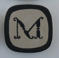
Kim Schoenberger - M
M - Underglaze - brushed on
Firstly, I transfered an imprint of the letter M onto the clay tile and using a very fine brush and a steady hand I've applied three coats of black underglaze. Three coats are necessary to achieve an even colour, if the application is not even a washed out look can result after the final firing.
 Finished with a solid colour border, ofcourse.....as it was easier to do three coats solid rather than attempting a fine line! Sanded and ready for bisque.
 Thought I'd share an extra image with you.... These are my clay tiles I'm using for each letter. I made (slab rolled) all 26 at once to keep them the same size, thickness etc...and have been stored in plastic since July, with an occassional mist spray to keep them leatherhard. They will eventually dry out and when they do I'll have to bisque fire them and apply my letter to bisqueware.
Monday, October 11, 2010
Kim Schoenberger - K L
I seem to be creating pairs of letters with two similar techniques.
K - Stamping - with foam and underglaze
Wanting to carve into foam I cut a square with a hacksaw blade. I first tried the dremel to shape a K, not to successful I might add! It just tore and grabbed at the foam. My second and successful attempt I used a hot soldering iron to melt away the foam.
 After a few test runs and getting the correct consistency with the underglaze, I felt confident enough to stamp the K. The foam is pressed very lightly into the container of underglaze, a gentle hand is needed in both soaking up the colour to stamp and when stamping, so it doesn't go into the negative space and leave behind a blotchy letter.
 Phew! All good, I had to hold my breath while doing this one!
 L - Stamping - with foam and porcleain slip
Once again the letter is burnt out in the foam using a hot soldering iron (...carefully and not inhaling the toxic fumes!)* and is cut to make a square.
 Reverse to the K tile, a thick and smooth porcelain slip is brushed onto the clay tile first. The foam sponge is gently pressed onto the tile to soak up the excess slip creating a nice texture surrounding and the letter is left smooth and slightly three dimensional. Extremely hard to see in this photo, a close look you can see the shiny bit being smooth.
 Almost finished K & L, I intend to sharpen the lines on K with black underglaze in a fine nib bottle and outline the L (now bone dry is almost impossible to see in the photo).
 P.S....CAN ANYONE PICK THE MISTAKE IN THIS POST?
Sunday, October 10, 2010
More letters from Sue
Herewith the next set of letters. Next weeks letters are also included. I see my Pug puppy had to get in on the act too! Kind regards, Sue


Mieke's October 4.
.JPG)
Saturday, October 9, 2010
JGR September Letters
Well, I've had these finished for a while, finally had a few minutes to post. They are computer generated letters with portrait bits included since my usual subject for sketching is portraits.


Friday, October 8, 2010
A lovely sideways addition
In the funny connecting world of blogs and and the 'interweb' Carolyn Barker, a fabulous jeweller found me over at Paperponderings looking for how to fold Japanese temple papers. As you do.
She left a comment and I always like to follow up with folk who comment so I went in search and found her 'in its early stages' website and these!


Can you believe how fabulous these silver alphabet rings are? You can see the full set of rings a-z here.
Carolyn kindly gave me permission to show them here as they match our world so well. In that other weird go around the world with the 'interweb' thing, we discovered we only live about half an hour's drive away from each other!
Christine: Simplicity this month

No adornments this month....just silk fibre, eventhough there are now pidgeon feathers in my art cupboard. I was a little overexcited getting one beautiful pink pidgeon out of my chook pen this week. Perhaps next months letters.
Wednesday, October 6, 2010
Une lettre par semaine / september
Bonjour,
Hello,
Voici la suite de l'alphabet... Encore l'écriture "Gestuelle Cursive", encore le carré tracé...
Here is the continuation of the alphabet ... Even writing "Gestures Cursive," yet the square layout ...


Et voici les "feuillets" complets...
And here are the "layers" complete ...


Je vous souhaite une bonne journée.
I wish you a good day.
Callie
Hello,
Voici la suite de l'alphabet... Encore l'écriture "Gestuelle Cursive", encore le carré tracé...
Here is the continuation of the alphabet ... Even writing "Gestures Cursive," yet the square layout ...
Et voici les "feuillets" complets...
And here are the "layers" complete ...
Je vous souhaite une bonne journée.
I wish you a good day.
Callie
Subscribe to:
Comments (Atom)