Showing posts with label chuckie. Show all posts

Tuesday, January 4, 2011

Second alphabet presentation


This alphabet was always going to be on black and in a book form. I am no bookbinder! :-D I am looking forward to ALAW 2011!


Saturday, January 1, 2011


Well, have seen others saying they were last, but here I am January 1 and posting my final letters. They were created in 2010! I have enjoyed working with this alphabet, and especially playing with the backgrounds. Presentation will be next. Am looking forward to ALAW 2011.

Tuesday, November 2, 2010

catching up a bit :-)


Here are my next letters. Different time of day, different background certainly give a different look to the letters. :-) I like a diagonal in the background. I don't care for the "R" with just horizontal colour in the background as much as the other backgrounds.

Tuesday, October 5, 2010


The next three letters...still playing around with the back ground colours and shapes. I am enjoying doing this alphabet.

Saturday, September 4, 2010

Next few letters


I am trying to be a little more experimental with this alphabet. With the "G" I tried a monochromatic background in the brown. There is something I like about it. For the "H" I thought I'd try diaganol background shapes. I'm not that it really works, but I may try another letter with diaganols that follow through "under" the letter. "I" is monochromatic green kind of graduated along. I like the brown one better, with more random placement of the different blocks of colour. The "J" doesn't ahve the red dots or diamonds in the letter, bascially because I forgot :-) but decided to keep it as another trial letter. I definitely like the letters better with the red in the letter. I also noticed that I although I put the blue on the left side of the letter, like the other ones, with the curve of the "J", it looks like the yellow is on the "outside" where the blue should be. I may redo this letter....we'll see.

Presentation (at last) of first alphabet :-)

I was stumped for a bit as to how I wanted to present/display the first alphabet. Although the squares are small, the vision in my head had always been like a border on a wall....so how to keep it in a straight line and yet be a feasible display. When I first started making the letters I had thought they would look on well on black but I didn't care for that at all. I played around a bit and came up with an accordian book in red!! I am very pleased with how it all looks!!


Friday, August 6, 2010

first alphabet completed

These are the last two letters for my first alphabet. I'm not totally thrilled with these letters but ready to be done. Presentation?? I have them on my wall in two rows and I like how that looks..not sure what else I would do, especially to display as a complete alphabet.

Sunday, June 20, 2010

Bernd letters in advance.


Here are two "Bernd" letters in advance. The top picture is how I am displaying these letters at the moment. Not sure what I'll do with the whole alphabet but for now it is fun...kind of a bouquet of letters sitting on my work table. Back in a month.


Working ahead!


I am off to Canada for four weeks so did some letters ahead of time. Here are the Copperplate ones.

Thursday, June 10, 2010

more catching up


I started my second alphabet but then found I want to finish up the Copperplate letters before continuing. :-) I am putting the Copperplate alphabet up on a wall , in alphabetical order and I found the gaps bothersome, so plan to finish it off before continuing on with the second alphabet.


Well, I am doing some catching up here. I decided to start my second alphabet and finish the copperplate later....no rules right? :-) A little back ground---I am Canadian from BC near Vancouver and belong to the Westcoast Calligraphy Society but I am living in Papua New Guinea and my attendance at inspiring workshops is mostly vicariously through articles in the WCS Journal . This alphabet was inspired by an article about a workshop with Peter Thornton on the work of Adolph Bernd. I was intrigued by the samples of work in the journal and thought I'd try my hand at it. I've decided to go with blue and yellow letters but hopefully there will be some exploration with the background and the decoration in the letters.

Thursday, May 13, 2010


Here are my latest four letters. I am feeling similar to Linda...looking forward to my next alphabet as it will be more varied and be more creative. I've started playing around with it.

Friday, March 19, 2010

Letters from Jan/Feb


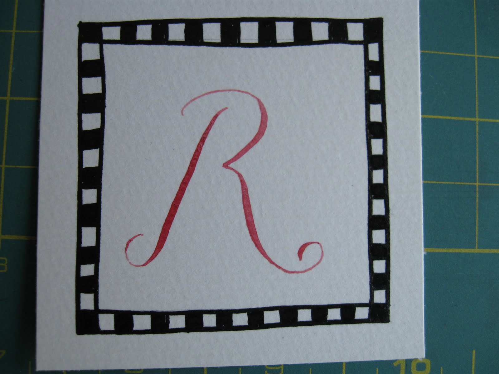
I have come late to Copperplate. I have a beautiful envelope from an exchange, gold ink on black envelope that inspired me to try it out and I was able to take a workshop through my guild last year, so it seemed a good one to do for this challenge, to get me to work with it. I have started with the letters that seemed to come most easily. :-) I am using water colours on water colour paper. The border is with Chinese ink.