Thursday, July 29, 2010

Letters on a rusted square

For my second alphabet I have chosen to use a font called Chiller. I chose it because it is reasonably free form and looks something like letters that are created by using a brush dipped in ink.


I have also chosen to work on squares of rusted thin metal sheets we had collected from the roadside collection. I am going to engrave the letters onto the metal and treat it with fixative as I want the contrast of the newly revealed metal against the rust.
I then will bend each square diagonally to create a shape that suggests a bird in flight.
The final piece I create from the whole alphabet will be like a flock of birds in flight.


JGR Recycled Alphabet

Hello everyone, for my second alphabet I've decided to use only re-purposed items from my studio. The backgrounds above are made from a watercolor (140 lb Arches HotPress) painting that  . . . 'didn't turn out' -  so to speak. I cut it into squares and pasted tissue paper scraps on top. In some places the background shows through which I like. I went back and 'painted' the letters with dimensional paint which comes in a small bottle with a narrow point so it allows for some 'precision'. I added the black border in PhotoShop. Thank you for visiting! 

Wednesday, July 28, 2010

MIEKE, A B C NUMBER 2

At first I wanted to make the second alphabet totally different. and thought of using photographs. But in the end I stuck with clay again. Although I will still use photo's as a reference.


So here we go first my photo's of the fruit.


Here are my little tiles still in the green ware stage, I will use stoneware clay this time for all my tiles to give it a better unity.

 I have applied the underglaze colours which hopefully come out a bit brighter wen fired and glazed.
But from experience my hopes are high!
It will be a challenge as well to find all the fruits I need and will use vegetables if needed.

Noela's letters

Week 4
Backgrounds 'blocked in' with white gouache.
Last week, my letters were running everywhere- some happily, others chaotically, so some discipline was needed. Unfortunately the lovely ones are no longer, but I still have 22 weeks to play with the letters -anything could happen!

Kim Schoenberger - C

C - Impression
Probably one of the oldest methods to make a mark onto the clay surface and has been used throughout all ages and cultures. Anything can be used to make an impression from found objects of organic or man-made materials, coarse open-weaved 'textured' fabrics to complex hand-made carved stamps!
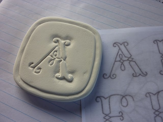
I'm opting for somewhere inbetween, by carving my letter into a plaster tile and making a stamp in clay, *Bisque firing it, to then, press into the 'soft to leatherhard' clay.
Transfering the letter C into the plaster tile (I prepared earlier) with a pencil & transfer paper, leaving an imprint into the plaster.
To make a plaster tile; a small mix of plaster is poured into an ice cream container, once set hard it's poped it out making for a nice neat smooth edged tile to carve into.

To make the carving easier I'm using my Dremel with it's U-beaut pointy tool, just right for the fine lines. I used to do all my carving painstakingly by hand with a carving blade, e'ons later....! Finding the dremel has made life sooooo much easier it carves into plaster like butter.

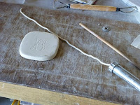
Making the clay stamp from the carving...
Once the carving is done in the plaster tile the plaster dust must be cleaned out or it'll effect the imprint of the clay stamp were going to make. A ball of clay is rolled and flattened with pressure over the carving and a handle is attached... for easy stamping later.
* Bisque firing the stamp - generally before undertaking (the transfering and carving in these few steps above.... ) shrinkage is considered, the size of the C is increased the same percentage as the clay body shrinkage because in all firings clay bodies shrink and with each temperature a different rate of shrinkage... still with me? But seeing I'm fast tracking and am reasonably skilled enough I've cheated a little and made the tile the same size as the photocopied image; making the stamp and drying it off a little in the kiln to harden just a little and then carefully stamped into the clay.
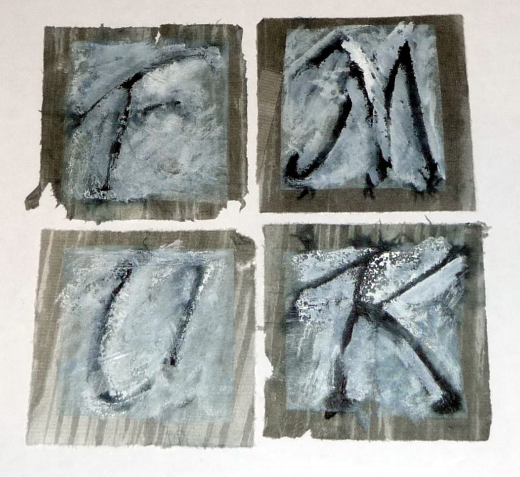
Final result, C sanded and ready for bisque firing.

Tuesday, July 27, 2010

2nd Alphabet


Have had a few ideas buzzing around in my head and now look forward to sharing with you all my second alphabet.

This time I have used BFK Rives paper and have embossed it 3 times to create the illusion of different levels. [ do hope you can pick this up in the photograph ]

Painting the background with a very pale pink wash of water colour and when dry, overlaid it with my garden of flowers in acrylic. Ann S.

Monday, July 26, 2010

Helen's first alphabet - final piece

Here it is...

June and July Letters

I got a little behind since June and July were busy with celebrating my Young One's graduation from high school,  family birthdays, and my parent's 67th wedding anniversary on the Fourth of July. I am now caught up with June and July.

June: The K is a nod to the counted cross-stitch I used to do before calligraphy took over. E and L  were designs I've done in the past. W is copied from the Worcester Polytechnic Institute (WPI) schwag where The Young One will be attending in the Fall.

July: Inspiration found in books. E from a color blind test. The rest of the letters came from Canadian calligrapher, Ruth Booth's Scrapbooker's Alphabet.

Five blocks have been completed. The gremlins have enjoyed making four letter words. They haven't discovered the fifth block yet. Always fun to see the words they leave behind.

Sunday, July 25, 2010

Helen's last letters

Helen has been out of action for a while, but has finished the last of her letters! Her completed final piece will feature shortly (once I get my act together - apologies Fiona).

Tubular peace bell for my first alphabet

There are so many great pieces being posted that I felt I needed to get my skates on and put my first alphabet together in one 3D sculptural piece.
I decided to to create a set of tubular bells on the theme of peacefulness and joy. So I have used the vowels to create five pipes with the following words: pax, joy, hum, lit (for light) and zen. The other eleven letters were used to create two other pipes.


As you can see from the photos above the final piece took on a bit of a temple bell look.
It all took a bit longer than I thought. I needed six rivets per letter as some of the foldformed letters and beaten metal letters were pretty hard to bend around the pipe; and of course I needed to make and paint the stand; and Fiona and I needed to discuss options for hanging the pipes and their length; and then they had to be cut and drilled; and hanging them with nylon fishing line was the final challenge.
The good news is that whilst they are not tuned they do make a lovely sound.

Saturday, July 24, 2010

Kim Schoenberger - B

I intend to post a letter a week so I can explain my process as I go step by step... mostly via images and inturn making my monthly report of all four letters shorter.

B - applied clay
Using an extruder for icing cakes, porcelain clay is extruded through to make a small coil. A fine 'B' imprinted into the clay tile, via tracing paper.

...starting to build the letter by using the extruded coil, placed over the imprint with a little water to secure and adhere.

Letter B starting to take shape, tools used; brush to apply water on imprint and pointed wooden tool to shape the clay and run along edges to seal.

Fine tuning... adding more coil on each end and in the centre and shaping. Carving the edge for the border with a carving tool, still at the leatherhard stage.

Finished off by leaving to dry then sanded with a fine sanding pad for a smooth surface (in the raw stage ready for bisque).

Thursday, July 22, 2010

Noela's latest

WEEK 3
...hmmmm, more smudging as I glued the tissue paper over the background. Once dry, I ironed the letters which made them nice and flat but they are still smudgy.
Time to get out the white ink - see what I can do with that.

Wednesday, July 21, 2010

Done and dusted!


Well everything is now in it's box and has a home. Experential wanderings have been enclosed and trapped in their own space, now I can clear my head and venture forth.....new beginnings.....new letters.....new???????

Tuesday, July 20, 2010

NOELA'S WEEK 2

Last week was week 2, and I painted some tissue paper with mottly blues.
The idea is to cut tissue squares a little smaller than the 7cm backgrounds and to paste them over the ink drawn letters to soften the effect.
 
One of the problems I faced was that the tissue stuck to the plastic background when dry, so some of the tissue had to be scraped off ending up rather like crepe paper. 
Fortunately there was enough 'good' painted tissue left to use for my overlays.

Kim Schoenberger - 'A' ...a change of medium!

With all good intentions in getting a head start with my recycled teabags, I go and change my mind!
Once I explored my options in clay, the spark was ignited and I just had to go with it.
I have chosen to use Porcelain clay, and will be using different methods and techniques to create each letter. Seeing that they are so small and my kiln much larger, I have decided to complete the whole alphabet.... then place them in a bisque, glaze, then fire to Stoneware. So each image initially will be at the raw stage until I start firing in the kiln. And, I have decided to use red, black and white as my colour scheme.

Using a slabroller to make my 7 x 7cm tiles, firstly, I have to allow for shrinkage...each clay body has it's own shrinkage rate and at different temperatures. In this case I've allowed for 12% shrinkage. Fingers crossed the end result will come close to the desired size!

Great skill went into the design for cutting the tile, a round tin close to 7 x 7cm. Yep... that'll work, a flaten here and a flaten there, makes for a nice 7.84 x 7.84cm (must allow for shrinkage)square'ish shape...a test drive and it's a go'er!

Patience is a must in claywork especially in the winter months. Once the slab is rolled the tile can be cut...care must be taken as clay has a memory, if it is distorted at this stage and reflatened it will remember and distort back in the final firing. So it is left until the leatherhard stage (inbetween - wet & dry) before working on it
A - Carving technique: light pencil drawn to transfer letter with tracing paper onto clay the tile, with a carving tool cuts are made into leatherhard clay. Thought is applied to the angle of the cut to create a 3D effect. Carving at the leatherhard stage creates little beads of clay along the cuts these are left until the clay is dry enough to sand off which keeps the edges sharp and precise.

Sunday, July 18, 2010

NOELA'S SECOND ALPHABET

Yeah!! I have started my second alphabet.
I am trying an entirely different approach with this one.
I have decided to do 26 stages of the whole alphabet rather than 26 letters individually. That way I can let the letters 'evolve' and I can share the challenges and solutions along the way.
WEEK 1
I used a PILOT Parallel Pen on soft Japanese pre painted paper.
I had problems with the ink bleeding but wanted to persevere because I like the background paper.

Wednesday, July 14, 2010

Mieke's finished alphabeth.

The finished first alphabet, it turned out different then I anticipated, axially TOTALLY different! But I am happy with it. And now on to number two! Still trying to work out how to,..... will I stick to clay or something else? Better get my act together and start on it.

Et maintenant, le premier alphabet - And now, the first alphabet

Bonjour,
Hello
Que vont-elles donc devenir, ces lettres par semaine ? Les stocker ? Ca ne convient pas à la ligne éditoriale de la maison... ;) Les jeter ? Cela choque mon sens de l'économie... J'ai trouvé mieux... ;) Je les ai reliées en carnet... un peu comme un abécédaire... mais sans illustration... avec une reliure japonaise...
What will they then become, those letters per week? The store? It does not fit the editorial line of the house ... ;) Throw? This offends my sense of economy ... I better ... ;) I have related in the book ... just as an ABC ... ... but not illustrated with a binder Japanese ...


Je ne suis pas sûre d'être tout à fait au point en ce qui concerne la reliure japonaise, mais je vais bien finir par savoir m'y prendre... Par exemple pour ce carnet, je crois qu'il aurait fallu que je laisse davantage de papier sur la gauche des lettres alors que je les ai centrées sur l'adossement. En reliant les cartons "chocolat", le fil emprisonne trop de la marge gauche...

I am not sure of being right at the point in regards bookbinding Japanese, but I'll get to know me well ... take for example this book, I think it would I had to leave more paper letters on the left while I have focused on admission. By connecting the pipeline "chocolate", the wire traps too much margin left ...

Bonne journée.

Sunday, July 11, 2010

Lettres de juin - les dernières - last letters

Bonjour,

Voici venues les dernière lettres de la première série "lettres de la semaine pour 2010"... J'ai utilisé des alphabets dont je n'ai pas du tout l'habitude, pour une seule lettre, ça pouvait aller... Ce sera à travailler un petit peu plus tard.

Hello

Here come the last letters of the first series "Letters of the week for 2010" .. I used scripts that I have not used for a single letter, it could go ... This will work a little later.


J'ai trouvé une petite brochure de calligraphie "Anglaise"...  La première partie montre les minuscules, la deuxième les majuscules, dont est issu ce "Y". Pour l'application de la couleur, j'ai utilisé l'effet "monotype"...  Je devrais faire cela plus souvent. Cela donne du relief.

I found a small booklet calligraphy "Anglaise" ... The first part shows the tiny, second upper, which resulted in the "Y". For the application of color, I used the effect "monotype" ... I should do that more often. This gives relief.


Et la troisième partie de la brochure montre une interprétation plus moderne dérivé de cet alphabet "Anglaise"... imprimé ensuite d'un tampon décoratif "écriture...

And the third part of the brochure shows a more modern interpretation derived from the alphabet "English" ... then print a stamp decorative "script ...


Voilà, la première série est finie... Il ne reste plus qu'à arranger ces lettres...
Bonne journée

So, the first series is over ... It only remains to arrange these letters ...
Good day