In an another life I spent 14 yrs working in places like Sydney, Melbourne and Adelaide as a graphic designer.
Before Letraset or computers to depict a letter you had to paint or draw it.
I had loved calligraphy at art school, however being left handed my ‘thicks’ were often misplaced.
The short of this is that I love lettering and letter form in general hence my involvement in this worthy project.
Having a reputation for tackling things from the ‘wrong’ perspective I am probably not sticking to the ‘letter’ (pardon the pun) of the law.
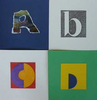
All my letters fit into a 7cm X 7cm space.
As I am considering my final presentation I have put them all on bigger squares because I like the space, or simply because the paper already had something on it that worked with my letter.
As a graphic designer I am accustomed to search all relevant possibilities which means I may appear to be jumping all over the place using different ideas and techniques ... and I am.
Moving from collage to watercolour to pen & ink etc..
I am fascinated by the minimal and find the spaces between letters speak volumes and may within the 7 X 7 space, become the letter or part thereof.


3 comments:
Oh wow Jim - these are fabulous! I love the variety and experimentation as well as the strong colours. Thanks for joining in!
Fiona
I love your outside the box approach, especially the "H"
These look great! Your "A" really appeals to me as it's stands out amongst the rest.
Post a Comment