Sunday, September 12, 2010

Lettre de septembre - letters of September

Bonjour,
hello,

Please kindly accept my apologies for my delay: it was back in class and ... great work again ..

Voici la suite de l'alphabet... Toujours l'écriture "Gestuelle Cursive", toujours le carré tracé...
Here's the rest of the alphabet ... Always write "Gestural Cursive" always the square route ...


... Et toujours l'alphabet en complément du carré sur la page...
... And always the alphabet in addition to the square on the page ...


Bonne journée
Have a good day

Saturday, September 11, 2010

Heather's 2nd set of 2nd alphabet letters

Thought I'd get this one in early. My second alphabet, Spencerian...I just love this flowing script....could write it all day.

Thursday, September 9, 2010

Linda's completed first alphabet


Here is an image of my first alphabet framed and hanging in my studio.

letter L from Linda


One more letter - it didnt fit onto the last post. Next group will be posted mid october. Cheers.

August and september letters from Linda


Here are my next 6 letters - G to L. Some of them are pretty unrecognisable to the uninitiated , but great fun to do! I am copying an alphabet designed by Paulus Franke in 1601, but adding my own colour. Parallel pens work a treat with these.

Jeanette's first alphabet arranged


Jeanette’s Alphabet 1 is arranged in a PERFECT PANGRAM, that is, each letter is used only once to make a sentence. As you would expect most perfect pangrams are somewhat nonsensical. The one I chose is: Cwm fjord veg balks nth pyx quiz. This can be interpreted as: Relaxing in basins at the end of inlets terminates the endless tests from the box. (Thank you to contributors to Wikipedia for this bit of fun.)

Wednesday, September 8, 2010

Sue's 1st September letter

My second letter "i" for Sept. Yeeeaah! I am on time at last! Warm regards, Sue

Tuesday, September 7, 2010

Jeanette's Lindesfarne letters


These four letters are derived from the letters
in the Lindesfarne Gospels from about the year 698, in England.


Sunday, September 5, 2010

Noela's weeks 9 and 10

I have broken with my methodical step by step approach this week - I am posting about the progression in my First Alphabet's final presentation. I made a half measurement, to scale, version of the green wooden box out of foam core and matt board. Then I photographed each outside and inside surface of the green wooden box. I adjusted the pics so that they were neat, scaled rectangles then printed them to size on a special plasticised copy 'paper' which is water proof and stands up to wear and tear. I fixed the images to the box with double sided tape and acetone based craft glue.
I plan to make some sort of concertina book which fits inside the box.

Saturday, September 4, 2010

Next few letters


I am trying to be a little more experimental with this alphabet. With the "G" I tried a monochromatic background in the brown. There is something I like about it. For the "H" I thought I'd try diaganol background shapes. I'm not that it really works, but I may try another letter with diaganols that follow through "under" the letter. "I" is monochromatic green kind of graduated along. I like the brown one better, with more random placement of the different blocks of colour. The "J" doesn't ahve the red dots or diamonds in the letter, bascially because I forgot :-) but decided to keep it as another trial letter. I definitely like the letters better with the red in the letter. I also noticed that I although I put the blue on the left side of the letter, like the other ones, with the curve of the "J", it looks like the yellow is on the "outside" where the blue should be. I may redo this letter....we'll see.

Presentation (at last) of first alphabet :-)

I was stumped for a bit as to how I wanted to present/display the first alphabet. Although the squares are small, the vision in my head had always been like a border on a wall....so how to keep it in a straight line and yet be a feasible display. When I first started making the letters I had thought they would look on well on black but I didn't care for that at all. I played around a bit and came up with an accordian book in red!! I am very pleased with how it all looks!!


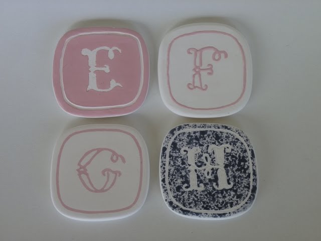
Kim Schoenberger - EFGH & I

EFGH & I - Techniques...
Porcelain tiles... bisque fired:
E - Resist with paper
F - Slip trail
G - Inlay
H - Resist with latex
...and

I - Resist with shellac

ps. all details on techniques found in labels under Kim Schoenberger

August Letters JGR

Hi everyone-for my second alphabet I'm using 'found items' from my studio. As usual there is no plan, I just start working and see what ideas come to me. This time, I was going through a box of words and phrases cut from magazines. E was inspired by the phrase "Erase your flaws".
I decided to crop the edge of the background text slightly.
F is "No Fear" a concept I'm working on . . . still.
G - "Youth is in your genes". I guess we're never too old to be young again.
H is "How" as in how will I make all of those things come true? It was fun just to ride the wave of inspiration as it fell into place.
Have a great weekend, thank you for visiting!

Thursday, September 2, 2010

Fiona's e f g h

I have continued to stitch into my rusted braille paper and I am so happy that I discovered embroidering paper - who'd have thought? Each week I add a bit of decoration in the background to make the letters slightly individual. Despite the photos - they are all stitched in a beautiful soft grey thread.

E - I made a series of small spiral swirls with a lead pencil in one corner of the square

F- A few bits of silver leaf were attached - I like how they echo some of the shapes in the rusted paper

G- I chose some interestingly marked paper and didn't embellish it as there is quite a bit of letter going on

H- Once again, burnt incense holes and charring appear...

Valerie's Alphabet


The ancient Q - not the letter 2


Wednesday, September 1, 2010

Dead bird on the mountain


Christine: The beautiful kite I found on my walk lives on in spirit in my September letters. It was remiss of me not to choose those very letters, but not to worry there are many more so I will spell it out then. The whole bird was dead by the road....the next day only feathers remained. A little tender loving care and they now live on.....

Spring letters

Spring visited us today - a lovely mild sunny day - what better day to post my next set of letters.


You might recall for this second alphabet I have moved away from shiny brass to shiny letters on a rusted background. I am using a font called Chiller; and I am engraving through the rust into the metal below. To keep the shine of the letters I am coating it all with a matte art varnish.


The letters will become part of an installation called something like letters in flight; or a flock of letters.

Sue's second 2nd alphabet

My August letters. I have changed my theme and wish to submit a set of contemporary Batarde capitals. I was inspired by Ward Dunham exemplar which I obtained from Ewan Clayton when I attended his workshop in 2000 in Cape Town. I will re-do the July letters and hope to now catch up.  Warm regards, Sue Williams