Sunday, August 8, 2010

second alphabet started at last


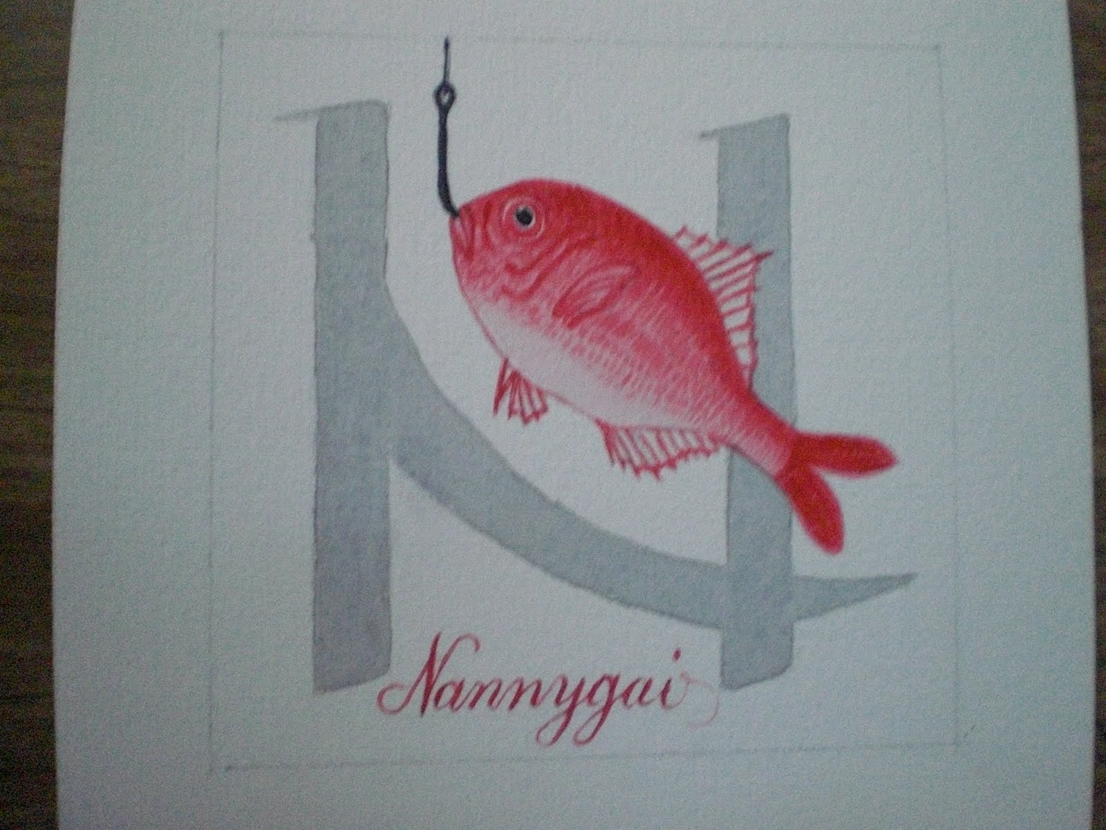
I Ihave been doing a lot of research for my second alphabet. I thought I would do a series of historical decorated letters, each letter a different style from a different period in history. This was for my own benefit (for my teaching notes) as well for this project. However once I started I realised the letters had nothing of 'me' in them . That was until I hit the 17th century and found a vast array of Baroque decorative capitals that writing masters created to show off their expertise - like wow! OK not everyone's cup of tea for sure, but there was so much potential to PLAY with line and colour and go really over the top here! So I have started with a rush and done the first 6 letters based on a sheet of caps created by a German writing master called Paulus Franke in 1601. I used speedball C nibs or parallel pens for the thick lines, a copperplate nib for the thin lines and Mattise acrylic inks for all the colour. This is fun!

Friday, August 6, 2010

first alphabet completed

These are the last two letters for my first alphabet. I'm not totally thrilled with these letters but ready to be done. Presentation?? I have them on my wall in two rows and I like how that looks..not sure what else I would do, especially to display as a complete alphabet.

August Letter

Oops I forgot this one and added two images of the doodle 'O'

August Letters


Thursday, August 5, 2010

Kim Schoenberger - ABCD 2

ABCD - Techniques....
Porcelain tiles - still in the raw stage:
A - Incising
B - Applied Decoration
C - Impression
D - Sprigg Decoration

Kim Schoenberger - D

D - Sprigg Decoration
Making spriggs are relatively easy and are great for repetitive, low-relief motif decoration on a clay surface. I've created my 'D' sprigg by carving into plaster with my trusty dremel as I did for my 'C' although, this time I've carved a larger negative space.
After tracing my letter D onto the plaster, I've carved to make the D. I liked the texture the carving tool created, when the clay is pressed in to make the sprigg, it'll give great texture in the clay.


A test is made (as above on right of plaster) with a small piece of clay to see if the D looks ok, this also takes away any fine plaster dust left from the carving. Taking another sprigg; finding it's final position, scoring both sides of the tile and the back of the D sprigg ...

...the two are joined gently.

Lots of care and a steady hand are needed here, making sure no air has trapped underneath, a good join... so it doesn't pop off in the firing and clean and neaten the edges.

D - sanded and ready for bisque firing.

Wednesday, August 4, 2010

Heather's new alphabet

Here is the start of my second alphabet. I have mounted my first one and will photograph it and send to you as soon as it is able to be hung.

My last alphabet was of found objects...this one is my favourite Spencerian Script on "plastic" paper, mounted on foiled paper which I cut from a Brandenberg Concert Brochure and which has been hidden in my scrap paper basket, waiting for the right moment. I had a hankering to do some writing this time. Carpe Diem...22 to go.


Flutterings


Christine is now stepping out into the breeze, taking a deep breath and "moving forward" to the next alphabet. The letters are all going to be silk in one form or another. Perhaps a hat for the finished product for Melbourne cup. Alphabet Racing Hat! These letters APCB are the beginning. They are soy silk fibre felted onto a leaf for embossing, and centred on a florist wire for flexibility ....so each is their very own alphabet flower. Sorry photos are not going to do them justice.

2è alphabet - 2nd alphabet

Bonjour,

Hello,

Pour cette nouvelle série de lettres à la semaine...

- Je ne m'occuperai pas des supports, mes petits papiers sont déjà tout prêts : il s'agit des fonds que j'ai réalisés à droite et à gauche sur des formats A5... Ils seront pliés en deux sur eux-mêmes et travaillés comme les pages d'un cahier en recto-verso. Et de surcroît, je déstocke... ;)

- Je ne m'occuperai pas de l'écriture, j'ai travaillé la variante "écriture" pour la première série : pour la seconde, je travaillerai uniquement la "cursive gestuelle" que j'ai apprise en cours. Cela me fera de l'entraînement...

- Sur chaque "page" (ou "petits papiers"), je tracerai le carré de 7x7cm dans lequel viendra s'insérer dans un premier temps "la" lettre en cursive gestuelle donc.

- Mais j'ai décidé de me forcer à travailler davantage la composition... Pour chaque "page", pour chaque lettre dans son carré donc, je vais "ajouter" un alphabet que je vais tenter de composer à chaque fois de manière différente. Pourvu qu'il me soit possible de trouver 26 manières différentes de composer un alphabet !

Et à la fin, toutes ces pages seront reliés ensemble avec une reliure japonaise... ou quelque chose comme ça...

For this new series of letters to the week ...

- I do not take care of the media, my little papers are already ready: it is the money I made from right to left format A5 ... They will be folded in half on themselves and worked like the pages of a book on Both Sides. And furthermore, I destocked ... ;)

- I will only not writing, I have worked the alternative "writing" for the first series for the second, I will work only "cursory gestures" that I learned in the course. This will give me the training ...

- On each "page" (or "little papers"), I will trace the square 7x7cm in which slot into a first time "the" letter in cursive gestures so.

- But I decided to force myself to work harder composition ... For each "page" for each letter in the square so I'll "add" an alphabet that I will try to call each time differently. Provided it is possible for me to find 26 different ways to compose an alphabet!

And in the end, all these pages are linked together with a binder Japanese ... or something like that ...

Voici les carrés.

Here squares


Et voici également les "pages" entières... avec donc la "composition" de l'alphabet par rapport au cadre contenant "la" lettre...

And here also the "pages" entirely ... So with the "composition" of the alphabet from the frame containing "the" letter ...


Voilà donc le deuxième alphabet parti au long cours... Espérons que cela me fera effectivement travailler les compositions... Parce que ça ne sera pas du temps perdu ! Il faudrait tout de même que je progresse un petit peu...

So the second alphabet party-going ... Hopefully this will make me actually working compositions ... Because it will be time well spent! It would still I'm progressing a little bit ...

Passez une bonne journée
Have a good day.


NOELA'S WEEK 5

I feel like I'm going around in circles here. I have redone the letters on my tissue and gouache background, but they are now too contrived. I was pleasantly surprised that many of you liked the smudgy letters of 2 weeks ago, so maybe I'll glue wet teabags over the letters [which are sure to smudge again]. I'll give it a try and see what happens. Stay tuned!!

Alphabet 2 begins...

After a few false starts, I have worked out what I am doing for the second alphabet.

I have chosen to create an exemplar/sample book of my personal heartbeat script.  I have also found myself in a happy place of recent times stitching into paper, so am stitching the letters; sometimes filling them in, sometimes simply outlining them

I am also working on rusted braille paper - I love the texture and the variations.  Each week I am also adding a design element of sorts to the background to help make each letter unique.  This alphabet feels like me!

Tuesday, August 3, 2010

Jim's alphabet continues!

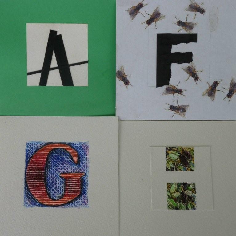
The flies he assures me....came from the simple idea of 'F for flies' and he just happened to have some lovely wrapping paper he had received from a friend.... who felt that Jim would like the idea of flies rather than flowers...


Jeanette's historical journey

My second alphabet will be developed in reference to historical documents. These four letters are based on those found in the Book of Kells, from circa 800 AD. The letters are worked in watercolour onto rag paper, and I think they lose some of their character by not being in a series.


Thursday, July 29, 2010

Letters on a rusted square

For my second alphabet I have chosen to use a font called Chiller. I chose it because it is reasonably free form and looks something like letters that are created by using a brush dipped in ink.


I have also chosen to work on squares of rusted thin metal sheets we had collected from the roadside collection. I am going to engrave the letters onto the metal and treat it with fixative as I want the contrast of the newly revealed metal against the rust.
I then will bend each square diagonally to create a shape that suggests a bird in flight.
The final piece I create from the whole alphabet will be like a flock of birds in flight.


JGR Recycled Alphabet

Hello everyone, for my second alphabet I've decided to use only re-purposed items from my studio. The backgrounds above are made from a watercolor (140 lb Arches HotPress) painting that  . . . 'didn't turn out' -  so to speak. I cut it into squares and pasted tissue paper scraps on top. In some places the background shows through which I like. I went back and 'painted' the letters with dimensional paint which comes in a small bottle with a narrow point so it allows for some 'precision'. I added the black border in PhotoShop. Thank you for visiting! 

Wednesday, July 28, 2010

MIEKE, A B C NUMBER 2

At first I wanted to make the second alphabet totally different. and thought of using photographs. But in the end I stuck with clay again. Although I will still use photo's as a reference.


So here we go first my photo's of the fruit.


Here are my little tiles still in the green ware stage, I will use stoneware clay this time for all my tiles to give it a better unity.

 I have applied the underglaze colours which hopefully come out a bit brighter wen fired and glazed.
But from experience my hopes are high!
It will be a challenge as well to find all the fruits I need and will use vegetables if needed.