Monday, April 5, 2010
Sunday, April 4, 2010
My first four
I´m glad to share with all of you my first four letters, those are captured from nature and different objets around me.
RAQUEL RONDON
Caracas.Venezuela
RAQUEL RONDON
Caracas.Venezuela
Thursday, April 1, 2010
March Letters

This month found me moving from the traditional to brush letters. An out of the square move for me. I'll be experimenting more with the brush. I liked the freedom and the fluid feel of the tool. The letter "R" was done for the record breaking rain my state of Massachusetts has had this month. We've spent each week of the month mopping water out of the basement. Turquoise water color with Dr. Ph Martin gold and silver dropped on it while still wet. Made me think of the rainbows created in puddles. The letter was drawn and colored with water soluble oil pastels. If you look carefully at the letter, you can see spots where the rain hit the paper. I was out at 1am for the finishing touch as the last band of heavy rains blew in. Good thing it was pitch dark and no one could see me. Otherwise, the neighbors would be saying I ain't got enough sense to get in out of the rain.
Wednesday, March 31, 2010
The next 4 from Mieke.
The four for march,
W-Terracotta clay, white stoneware clay letter with a green glaze.
Z- Slumped glass
E- B.R.T. clay, with a crawl glaze.
T-B.R.T. clay letter in a crawl glaze, outside is a crystal glaze.
By doing this first alphabet, my mind is working on the next one, what to do?? what to use? So many possibilities, it just makes ME curious at how it will look like!
March metal letters
I just love how the ALaW is developing - so many different mediums being put into play on something that is so familiar to us all.
I have continued with my metal letters - great when you can get metal to rhyme with the month.
I have photographed the letters out of sequence as the letter J was the only one that had curves; and so I wanted it centred to standout amidst the other foldformed letters. As you can see from the letter I the foldforming can create a bit of tension in the metal - I can't always get them to sit flat.
Monday, March 29, 2010
Calm after the rain:
Noela's next letters
I am posting 4 letters today as I will be away for the next couple of weeks. This should bring me up to date as of April 12th.
...'j' select, rotate, clone,
...'K' select, rotate, clone,
...'L' select, enlarge and clone,
...'m' select, rotate and mirror.
I had a bit of trouble with the 'L'. There was a printed L inside the box, but I wanted to give myself a bit more of a challenge because the J and K were fairly straight forward. That bent nail on the box lid is being put to lots of good use!
Lilo's February letters
My letters are done on Yupo paper which is an Asian paper 100% Polypropylene. It does not absorb watercolor and thus you can shove the paint around. You can also remove all color by wiping off with wet rag and start again. I find it lots of fun to play with. . . Once you have finished a painting you must spray it with a fixative to save it.
Lilo Meany
Lilo Meany
Kim Schoenberger's ALaw - IJKLM
I like the way in which my 'discarded' letters have presented themselves in pure spontaneity and find it even more interesting the ones that have been hard to find, into thinking outside the square.
K - has been my most challenging letter yet, funny thing...should I read into that? An old wingnut attached to a post cut in half (post - internal part to connect two door knobs) .
L - was a happy find, a chuck tool for tightening a drill bit into a drill,
M - just happened to come to me in the old rake head I liked the look of, abit cut of the end...cement still intact.
Labels:
ALaW,
alphabet 1,
discarded,
Kim Schoenberger,
March,
March Letters
Euan's first four letters


My inspiration comes from my love of classic cars, nice shiny ones with lots of chrome bits, where these letters came from.
A simple 7 by 7 frame using red electrical wire from another car was used to isolate the individual letter.
Where this theme will lead me, who knows, but what a great excuse to photograph old cars!
Sunday, March 28, 2010
Janna's first letters...
These are my first attempts.
In pondering my interpretation of letters I gazed at my studio wall where this key hung.
In it were 4 letters - I, D, O, U. Each letter was then accented in a cut out, dampened to hang over the key and photographed on some gorgeous rust (on the bottom of a drum).
In pondering my interpretation of letters I gazed at my studio wall where this key hung.
In it were 4 letters - I, D, O, U. Each letter was then accented in a cut out, dampened to hang over the key and photographed on some gorgeous rust (on the bottom of a drum).
Saturday, March 27, 2010
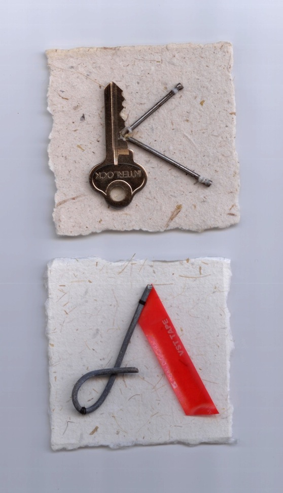
Jim's catching up letters...
In an another life I spent 14 yrs working in places like Sydney, Melbourne and Adelaide as a graphic designer.
Before Letraset or computers to depict a letter you had to paint or draw it.
I had loved calligraphy at art school, however being left handed my ‘thicks’ were often misplaced.
The short of this is that I love lettering and letter form in general hence my involvement in this worthy project.
Having a reputation for tackling things from the ‘wrong’ perspective I am probably not sticking to the ‘letter’ (pardon the pun) of the law.
All my letters fit into a 7cm X 7cm space.
As I am considering my final presentation I have put them all on bigger squares because I like the space, or simply because the paper already had something on it that worked with my letter.
As a graphic designer I am accustomed to search all relevant possibilities which means I may appear to be jumping all over the place using different ideas and techniques ... and I am.
Moving from collage to watercolour to pen & ink etc..
I am fascinated by the minimal and find the spaces between letters speak volumes and may within the 7 X 7 space, become the letter or part thereof.
Before Letraset or computers to depict a letter you had to paint or draw it.
I had loved calligraphy at art school, however being left handed my ‘thicks’ were often misplaced.
The short of this is that I love lettering and letter form in general hence my involvement in this worthy project.
Having a reputation for tackling things from the ‘wrong’ perspective I am probably not sticking to the ‘letter’ (pardon the pun) of the law.
All my letters fit into a 7cm X 7cm space.
As I am considering my final presentation I have put them all on bigger squares because I like the space, or simply because the paper already had something on it that worked with my letter.
As a graphic designer I am accustomed to search all relevant possibilities which means I may appear to be jumping all over the place using different ideas and techniques ... and I am.
Moving from collage to watercolour to pen & ink etc..
I am fascinated by the minimal and find the spaces between letters speak volumes and may within the 7 X 7 space, become the letter or part thereof.
Friday, March 26, 2010
Marg's March letters
Thursday, March 25, 2010
Flame On!


These letters were created with Flame Painter, a drawing website linked from Kim Kommando, the digital goddess. http://www.escapemotions.com/experiments/flame/index.html
It's so cool to draw with! I may never touch pen to paper to do my letters for ALAW. There are many variations for to your control: color, size, opacity, saturation. The background is either black or white, which gives the drawing a smoky effect.
Others have posted how they will put together their letters. I haven't decided yet. I want to have mine ready for the Montana State Fair where the Big Sky Scribes will have a show.
Tuesday, March 23, 2010
Subscribe to:
Posts (Atom)