Sunday, February 28, 2010

Still doing the Experiential thing.......


Well I feel like I am all over the shop but it would look a little contrived if I had letters in order doing it experientially. I am still not completely focussed and feel that the true letters and thoughts will be revealed in the second alphabet but this series feels organic and I am OK with that. I don't know how a watercolour can be organic but I think it is.

Making marks on metal for February

I have been hammering away and putting marks on metal creating my four letters for the month of February. I have given fuller descriptions of each of the letters as I have gone along so won’t bore you all by repeating details here.


As you can see I am sticking to my foldforming and stamping. Because E, F and H are straight line only letters they are created by folfldforming; whereas curvy G required the stamped approach. Whilst 22 letters of the alphabet include straight lines, 15 have only straight lines. So there are going to be 15 foldformed letters and 11 others.
The ALaW challenge is giving me the opportunity to develop foldforming skills – but as you would read in my post for the H it is just as easy to tear brass sheeting as it is paper - if one is a bit heavy handed that is.

Fiona's Four for February

It has been a busy month; but also one filled with this little project.  I have really enjoyed working with these different materials - my challenge for the year being to experiment with materials and methods I don't usually play with.

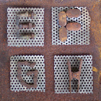
My "E" uses aluminium shim. I then used a ballpoint embossing tool to draw the letter and decorate it.
My "F"  looks like leopard skin! I wanted to use a cut-out approach and ended up writing lots of little "Fs" on black paper then cutting out the letter "F" from the lovely top paper  and having the little "Fs" show thru.
My "G" was another experiment - working with silk organza that I had rusted, then stitching the outline of the "G" in metallic gold thread and securing it to card which had gold thread wrapped around it.
My "H" was a rush job when all other thoughts had proven fruitless.  In the end, I used oil pastels on metal, covered it with copper leaf and then pulled the "H" out using a sharp pointy tool. I wanted it it to look free and easy without pulling all the copper off.

More details of the adventures with each letter are over on my paperponderings blog

Kim Schoenberger's ALaW - EFGH

Just getting these in the nick of time! Life duties dominated this month... and my rust hunts were limited so I had to take to my faithful stock pile to compile most of February.
Welding of these letters to the mesh has been a nightmare, the fragile nature of the mesh pitted out upon welding so I've needed to take a different approach as to how I attach each letter. Some letters I have welded and I guess some components will still need the use of a welder, but majority will now be attached by using a rusted wire tied at the back.

E - is a weathered brass bracket nuts intact with a welded nut and bolt placed in the centre,
F - welded on, with discarded plugs from cut out metal,
G - a rusted bike chain...still abit of movement under all the rust... shaped nicely,
and
H - a small clamp, not sure from what...with the spring...de-sprung.

Saturday, February 27, 2010

The 4 for February.


B- terracotta clay with the letter squeezed on in white stoneware slip, glazed in a blue earthenware glaze.
D- terracotta clay, background stamped with a skewer, painted with white slip. Letter glazed in red.

Q- slumped glass
X-brt clay, glazed with a matt glaze.
February lettersI need to mention that I am not a calligrapher so I'm a bit 'out of my league' but glad to be here. 
Last month, I gave myself a few rules for this challenge: Using my opposite hand only and no starting over. Each letter must be spontaneous for better or worse. I've learned a great deal so far and I've discovered a few nice techniques for loosening up: E-left handed with abstract shapes (inspired by some of my favorite acrylic painters' blogs) and a border. F- thick marker outline filled in with circular doodles, abstract color bars in the background. G-The details did not show up well but it's outlined in several different pen colors, then the yellow was added to define the letter which is slightly cut off at the edges. H- created the outline while holding two pens in my hand, it has a drop shadow, out-of-register effect which I liked so I filled in the odd shapes and placed it on a random background. Thank you for viewing!

Friday, February 26, 2010

Found Letters Detail

Found Letters


A little off-project but I thought these may interest you. They are found letters in Janna Pameijer's paper sculpture she shared with us today. There are even whole "words".

Tuesday, February 23, 2010

This week's letter - 'C'

Flip, clone, stretch and draw.
I used a new technique this week - actually 'drawing in' the shadow under the top part of the 'C'.

Wednesday, February 17, 2010

LETTER 'B'

My first five letters were the vowels, so now I will start to fill in the gaps.
'B'- select, flip, paste and clone.
The inside of my wooden box has some stamped writing indicating that the timber was originally from a gelignite box - a common source of timber for making recycled furniture and artifacts in the early part of the twentieth century. I have used the 'E' from gelignite, and a number '8' to make the 'B'.

Saturday, February 13, 2010

Gemma's First Four Letters ... at last


I have chosen to use up some of my in-class demonstration rolls for this project giving background texture that I don't have to think too much about. Then I just created the gilded letters drawn quite fluidly with a ruling pen. Enjoy!
Gemma
Maleny, Queensland

Monday, February 8, 2010

Coming to the party a bit late


Hi everyone! I am excited about this year long personal challenge. I haven't played with letters and calligraphy for quite awhile. To
catch up, I've posted an A I did in honor of Anne Van Tassell.

Friday, February 5, 2010

Gemma's First Four Letters ...

... are on their way. The second four will possibly come along at the same time :-)

What a splendid collaboration, a soothing balm for some, and, an exciting challenge at the same time, well done everyone so far.

x Gemma (Hobart, Tasmania)

Thursday, February 4, 2010

My first four letters

I am a bit late but enjoyed working on this project, and above all seeing what you all have done.

I used a Ruling Pen and Pelican 4001 ink. Paper is Arches 140lb CP. The effect on the paper was achieved by using Kosher salt, sprinkled on a soon as the watercolor is applied.

Lilo

January letters

After not doing any calligraphic work for three years, due to health issues that affected my husband and myself and on the way to a slowly recovering, this project is perfect for me. So, I decided to send this"Tropical Caribbean NaĆÆve Festival of Colors". I used gouache, color pencils, pastel, acrylic copper and metal nibs.

Mariella.
Caracas, Venezuela.

Wednesday, February 3, 2010

Letter E - Pam


I first applied a wash; drew over it with a gold crayon; painted over the gold with black Sumi ink and then drew an "E" with a reed pen which exposed the gold.

Letter C - Pam


The Letter "C" was written with a piece of balsa wood dipped in bleach over a wet watercolour wash

Letter B - Pam


The Letter "B" was written with the large end of an embossing tool; brushed with a dry brush and then a 2-colour watercolour wash applied. Interesting repelling around the letter

January Letters - Pam


I've had a lot of fun playing with some experimental ideas that I plan to keep as a reference.
Letter "A"was drawn with coloured pencils, wet, then an "A written with black ink whilst still wet.

January - Marg


As usual I am behind with everything and so my first alphabet is going to be a quick, simple one. I have created these letters on thick brown card because it was left over after I recovered my calligraphy desk and I hate to waste paper. Stick ink and red Uniball ink pen.

My January letters

I have been teaching Calligraphy for about 20 years, and consider myself
more or less a traditionalist as I like to be able to read some of the words
to understand what a piece is all about. That said I am trying to be more
adventurous in my style.

I have chosen to do one alphabet depicting images of Australia that appeal
to me and the second alphabet are lettering doodles. Both of these I can
use for my students.

Valerie


Tuesday, February 2, 2010

Kim Schoenberger - ABCD

Still on using that which I find on my rust hunts each week, in my letter 'D' week I just happen to find some old weathered leather straps and buckles used for horse riding. Not much in the way of rusted items, seeming rather disappointed...I looked over the leather again and ofcourse...
the D-ring on the strap!

My first 4 - Helen

Attached are my first four letters. They are on Arches CP 185 gm paper done with pencil and embossing . I propose to do all the letters on the one piece in 25 embossed windows. They are all going to be miniscules and the only criteria is that I find the shapes pleasing.

HJI


Monday, February 1, 2010

January Letters


I find myself in a place where my energy is siphoned in other directions. I know exactly how Bilbo felt in The Fellowship of the Rings when he said, "I feel thin, sort of stretched, like butter scraped over too much bread." I don't feel creative. I can hear that small voice whispering "why bother?" and other negative things. This project is a welcome balm. I hope the doing reignites the feelings of creativity. I hope to be able to dance as fast as I must but enjoy the small space of time each week. That's my goal. To have fun and to keep the commitment. January is completed. (-: A D A I


I am also enjoying seeing all of your beautiful creations. I can feel the stirrings in the fingers to try this or that. For now, the familiar is comfortable.